Ms Silva set homework which is to Complete flat plans of front cover, contents
page and dps Due next week Tuesday 22nd Jan. The
flat plan is to help visualise what my magazine is going to look like so that I
have an idea of what I am going do before I make the real thing.
Tuesday, 15 January 2013
"Quote; Unquote"
Today in Ms Silva's lesson I learn't about how to gain top mark for my magazine. As a class we had a look at the mark scheme for the research
and planning section criteria. Also we
talked about what the requirements and expectations are for our magazine’s. We went
through two past magazines and analysed what we like, did not like and what
could have been done better. This was to help us know what works, does not work
and what we can make better if in any case we had to make changes to our magazines.
It also made me aware of how important conventions are and proportion is when
creating a front cover, contents page and dps.
Focus Group part 2
This is the second part of my focus group video. I asked questions regarding both magazine's contents page's.
I asked my group:
What they though about the images, text , font and layout of the pages.
I asked my group:
What they though about the images, text , font and layout of the pages.
Focus Group Video
This is part one of a video about my focus group and a few questions I asked about two music magazine's front cover, contents page and dps.
A few of the questions I asked where :
A few of the questions I asked where :
- What is eye catching?
- Who do you think is the taget audience?
- Do you think this magazine relates to the RnB genre?
- What artist do you enjoy listening to?
- What do you think of the colours used in and on the magazine?
Monday, 14 January 2013
Music Magazine Questionnaire.

Once I have collected all the answers from the questionnaire, I will be about to analyse it and give feed back.
About Billboard Magazine
Billboard is
an international new magazine devoted to the music industry founded by William h. Donaldson and James Hennegan. It is one of the oldest trade magazines in the
world. Billboard recognizes music
charts that track the most popular songs and albums in various different
genres on a weekly basis. This is based on digital sales, downloads, radio
airplay and internet streaming. This magazine is about music professionals such
as record labels, executives, artists, music producers and radio dj’s. Billboard
magazine can be found in bookstores, magazine stands and distributer stores
such as Hmv. I do not think there is a particular target audience because the
magazine tracks all genre of music.
Billboard Magazine Double Page Spread

This
double page-spread is neatly broken up by images and text. This structure is
simple which some readers prefer, basically including three columns of text
with two images. To break up the overall layout, the use of pink text has been
used to add some colour to the page. Alexandra’s style and outfit gives various
connotations of power and freedom as the jewellery gives attitude and sexiness.
The slight low-angle looks up at Alexandra Burke, giving connotations of power
and superiority. Also the wind-swept hair gives impressions of freedom. Also
there is eye-contact with the camera, creating a direct relationship with the
audience.
Billboard Contents Page

The
layout of this contents page is abit crowed and has a lot going on but at the
same time has everything that someone would need reading this magazine to find
the page they are looking for. The contents page is split is into four and images
are incorporated with page numbers so that it is easy to find articles. Also the subheadings “up front, features,
music and in every issue’ high light the interesting things that are in the
magazine. The main image of the model / artist appears to be looking down and
in the direction of the text. The page numbers shown are the main features that
will appeal to readers. There is a column that shows songs in the charts which
is appropriate for this magazine as it is a ‘Billboard charts magazine’ that accommodates
all genres. The main colours are black, grey and white which pulls the whole
page together making it one.
Sunday, 13 January 2013
Billboard Magazine Front Cover
Billboard was my second magazine that I analysed. I chose Billboard because it is a internationally recognized music charts magazine that tracks the most popular songs and albums and relates to all genres because of the the of magazine it is.

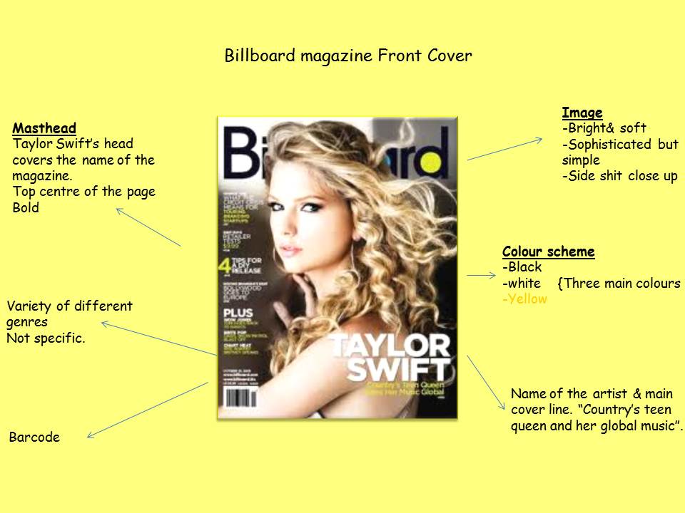
This is the cover of a Billboard magazine issue. It is a music magazine that targets a wide variety of music listeners as it does not have a specific genre. In the image of Taylor swift, she is looking straight towards the camera or some would say directly at the reader. This could be eye catching to the reader and make them want to buy the magazine. The image is centered in the middle of the page which is conventional whilst part of the masthead is covered buy the image itself.
The colour of the background in greyish matching Taylor's clothes which looks white. Her blonde hair and soft complexion adds to the setting of the image making the front cover look bright. The layout of the page is also simple with the subheading 'Taylor Swift Country's teen queen and her global music' going across her shoulder gives readers an idea about Taylor and what might be inside the magazine.
About Vibe Magazine

Vibe is an entertainment
magazine. It features hip-hop and RnB artists, actors, actresses and
other entertainers.
Vibe first began in the 90’s and was founded and
produced by musician Quincy Jones in partnership with ‘Time Inc’. The magazine
was originally known as Volume before being renamed Vibe. The genre of music
consists of RnB and HipHop music and artists. Unfortunately the production was
shut down in summer 2009. It was then resumed and purchased by a private company
and is now issued monthly. The magazine target audience is mainly aimed at
younger youth who are interested in the urban and hip-hop culture that is
music. The magazine always has someone who is doing well in the charts on the
cover like Mary J Blidge, Jennifer Lopez, Trey Songz or Beyonce. Inside the
magazine there are features, stories and facts about not just singers but celebrities
as well and a number of exclusive images,
- Celeb gossip columns
- Next profiled up and coming artist
- Photo spreads
- Images of high end fashion designers and their clothes on artists.
Vibe Double page Spread
In this post
I will be analysing Vibe magazine double page spread.

This is a double page spread from vibe magazine. it is effective because the main image is of the artist in a bright red dress which gives the article abit of excitement. whilst the small black and white images are simple. The connotations of the short red dress is sexiness which could draw readers in especially males. I like
the unique layout of this magazine because it is different to what other magazine
styles are. The main colours on this double page spread are white, grey/black
and blue. Whilst these colours are not very girls, the magazine will still attract
female readers because of Solange Knowles celebrity status. The article is set
out in four columns, three of them being on the left page and one being on the
right page. The font is simple making it easy to read .There is an introduction before the main article on the
left-hand page of this double page spread, it is in a different and larger font
from the rest of the text, this attracts the reader’s attention. The
introduction highlights the artists name in a different colour so it is clear
who this article is about, and will draw in attention of the fans of the artist.
Vibe Contents Page
This particular issue features a full scale image of kanye
West indicating that he is the main focus of this specific month.

The contents page consists of the main image. This is kanye
west which is again a clear link between the front cover and contents page
showing consistency though images. The word ‘contents’ is bold and striking
also being one of the main attractions on the page. It is an iconic style that
is continuously used with the magazine. This page is using a famous artist
which will make people interested as they would want to know the latest on him.
The background is plain which draws attention to the image of kanye with the
hand holding the heart on his chest. The
‘V’ hidden behind the image of kanye and the word contents in background shows that
this page is from vibe magazine. Also the grey scale colour used makes the red
heart stand out on the page. This instantly draws the reader to that point on
the page as it’s a connotation of love which could mean that this issue contains
facts about Kanye’s personal life.
Vibe Analysis Front Cover
I chose to analyse Vibe magazine because it is a very well known american magazine that focuses on celebrities in the music industry. This will later help me to create my own music magazine.


Vibe is a magazine which mainly features RnB and hip hop
artists. The genres are represented by the artists on the front cover. On this
issue it is Kanye west with the cover line being ‘I AM RAP’ showing a clear
link between the artist and the genre of the magazine. The three main colours
of this cover are black , blue and pink which connote the femininity but still
keeping it masculine and youthful for the young people that will read vibe meaning
that boys and girls can read this magazine and find things that they are interested
in. The cover line ‘The truth hurts Kanye west I AM RAP’ represents the artist
and the genre as being confident and cocky. The cockiness is not show through
the image as kanye’s facial expression is serious, not showing any emotion.
This is either because he is trying to portray this image or he feels that he
does not need to show expression, he knows he’s a star and the issue will sell
because of how famous he is.
Subscribe to:
Posts (Atom)